Team
Katherine Kuang (Designer), Brynn Arego (Manager), Meg Keys (Content Strategist)
Time
3 months
My Contributions
Stakeholder Interviews, Wireframing, Prototyping, Front-End Integration (HTML, CSS, JavaScript)
Tools
Figma, Visual Studio Code
Context
I spent my summer 2024 interning at General Motors (GM) on the Global Business Solutions (GBS) - UX Design team, which supports the GM finance department with internal UX Design projects. During my time at GM, I was tasked to integrate a new product into their Digital Marketplace. The Digital Marketplace is a hub that GBS created for the finance community at GM to submit ideas for projects, chat with other finance professionals, and expand their knowledge on different finance topics. Deliverables included meeting with stakeholders (business owners) throughout the process, designing mockups based on requirements, and integrating the design into the actual site.
Problem
How might we integrate a new product into an existing site?
I met with 2 business stakeholders to gather insight on the task and requirements for the project.
Primary Task
Integrate Tech Bytes (short burst videos on GM-specific innovation topics) into the Digital Market place to drive users to discover and use the new product.
Task Requirements
Add a Tech Bytes banner to the Grow Page located in the Digital Marketplace website
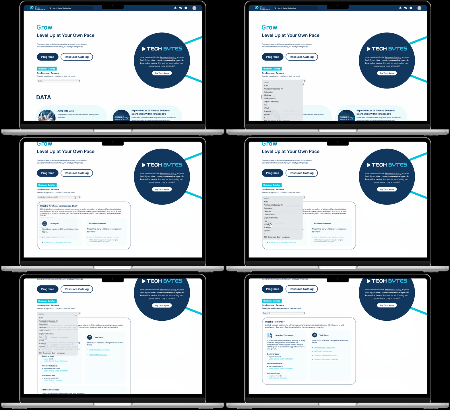
Add a Tech Bytes section and links to videos in the Resource Catalog dropdown located on the Grow Page
Tie resource brands only to their own courses in the dropdown
Add an Artificial Intelligence topic to the dropdown with its applicable courses
Solution
Developing & integrating an intuitive design to the entire page will drive users to insightful educational videos
Rather than just adding a banner promoting Tech Bytes and adding a Tech Bytes section to the Resource Catalog, it was important to make sure the flow of the entire page could drive users to use Tech Bytes. This project became an opportunity to update the design of the page overall to feel more cohesive with the rest of the Digital Marketplace site.
Easy Access and Knowledge About Grow Page Offerings
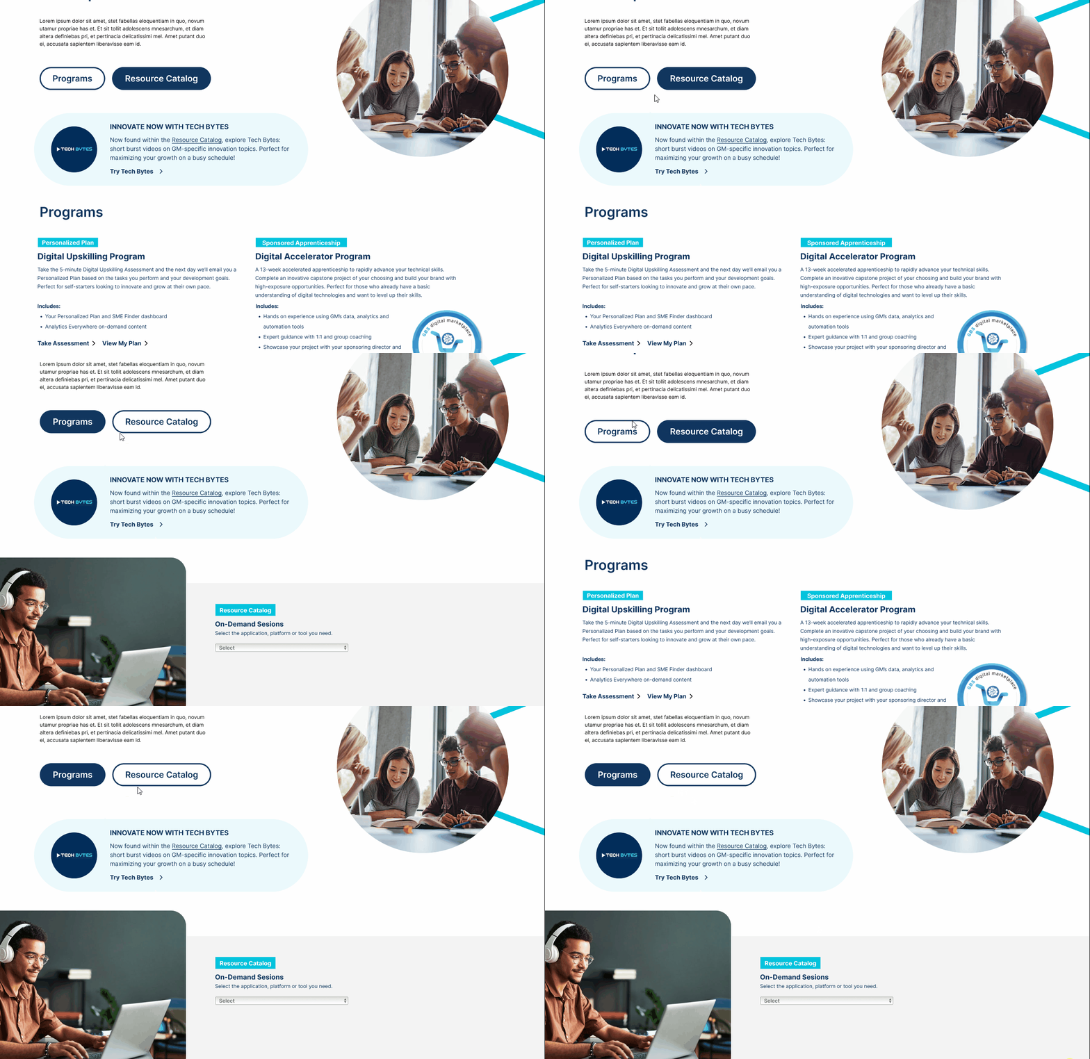
Program Offerings and Resource Catalog Offerings are both easily found at the top of the page
Easily switch between content of two tabs within the same page
Intuitive Integration of Tech Bytes Banner
Obvious Tech Bytes call out to introduce users to new product
Easy access to Tech Bytes’ landing page and intuitive understanding of where specific Tech Bytes can be found
Use of existing design elements within site to create a cohesive design
Clear Division Between 3 Resource Brands
Intuitively separating resource brands with separate cards
Variations of card layouts dependent on available resources
Initial Design Brainstorm
10 iterations of dropdown layouts, 6 iterations of banners
Initially, I jumped to designing rough layouts of the dropdowns and banners based on the given the original task requirements and more specific requirements for each component of the site:
Dropdowns
The dropdown lists out different topics that the Digital Marketplace offered courses on along with the courses themselves. It is required for the dropdown to have its three resource brand categories: Analytics Everywhere, Tech Bytes, and Additional Resources (third-party brands). These resource brands needed to be laid out to clearly indicate clear separation between the brands.
Banners
The banner calls out the new product/service. It should include a description about what Tech Bytes are because they are a new addition and still unknown by users, a logo to represent Tech Bytes, and a button leading to the Tech Bytes landing page.
After reviewing designs, the team felt this was a great opportunity to update the design of the entire page to build cohesiveness with the rest of the site.
Understanding the Existing Site
Taking a step back and looking at the site design as a whole
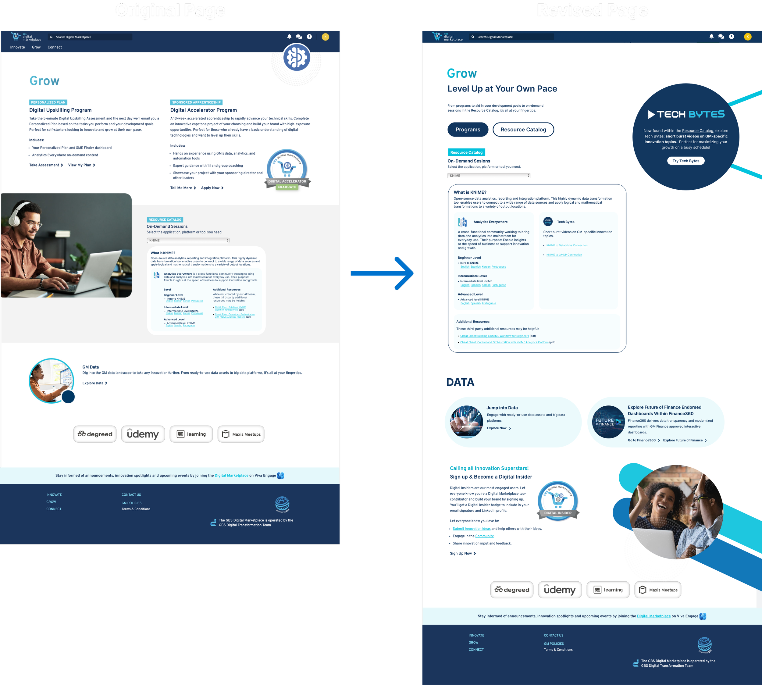
It was clear that there needed to be more clarification about what the Digital Marketplace offered within the Grow Page, more intuitive separation between resource brands in the dropdown, and more cohesiveness with the rest of the website (shown later on).
Design Iteration 1
Strategic Placement of Content
I worked with our team’s Content Strategist to come up with a new way to order content effectively throughout the page. She developed a content blueprint in which I translated into the first iteration of the new Grow Page design.
The main goal of this design was to create easy access to and knowledge of the two offerings located on this page (Programs and Resource Catalog), while adding in a Tech Bytes call out to introduce the new product to the users. The two cards would open up to their individual content on separate pages.
After reviewing the design with the team, I decided to work on cohesiveness for the next designs. The feedback I received included:
“The design still feels disjointed on the page”
“Current placement of the banner was falling flat”
“It still doesn’t feel well integrated with the rest of the site”
Within this same iteration… 2 approaches to the dropdown designs were applied
1. Now Approach
This approach focused on how the dropdown would look if it were to launch at that moment - separate cards for separate resource brands.
2. Scaling Approach
This approach focused on the future if there were more videos/courses added to Tech Bytes. Resource brands could be separated with a second drop down to avoid an overwhelming amount of content.
I decided to focus only on the “Now” Approach after reviewing the design with the team and receiving feedback that included:
“The additional drop down draws attention to segmentations that the general public doesn’t care about”
“The triangle next to Tech Bytes on Flow 2 feels like a button. Can the full Tech Bytes logo be used instead?”
Design Iteration 2
Creating a cohesive design
To create a more cohesive design for the page, I explored the other tabs within the site and used existing design elements within the site.
In addition to incorporating the existing design elements, interactive components and graphics were updated to be more user friendly and intuitive.
The Resource Catalog dropdown design was updated with a new picture representing the Tech Byte’s section with separation between the resource brands with separate blue cards.
Tabs were used instead of cards for users to easily switch between the different Grow Page offerings on the same page rather than opening up a whole other page.
After the changes, I received feedback that the placement of the banner still felt awkward and there could be a better placement where it’d still be easily found but also feel better integrated into the page.
Final Design Iteration
Transformation of the Grow Page
Integration
Coding the front-end of the design using HTML, CSS, & JavaScript
After completing my design and getting approval from the business owners, I worked on integrating the design into the actual site. I typed my code into Visual Studio Code and dropped it into Bright Idea (where the site is built).
Try out the Prototype
Reflection
What I Learned
Designing within existing guidelines and standards: I wasn’t designing a new site from scratch, I was integrating something new into an already existing site, meaning I had to keep in mind the existing guidelines of the site I was adding to.
Accepting constructive feedback: Every iteration I did needed feedback from either the design team to take in other creative perspectives or the business stakeholders to ensure I was meeting requirements. I wouldn’t have gotten the end design that I reached without feedback.
Following a new/unfamiliar design process: I am used to doing research (interviews, testing, etc) before starting off the design process. In this project, my focus was more to design first, and test for results after the design was complete. Unfortunately, the length of my internship didn’t allow for me to see the testing part of the process for this project myself.
Relearning how to code: I hadn’t coded in a few years prior to this project and was able to relearn to code while aiming to complete the design and integration with a deadline.


